
Many of us are learning a language, and apps like Duolingo have made this much easier and arguably more fun over the last decade or so. These apps turn learning into a game with features like streaks, social networks, competition, and rewards. I have been learning Mandarin for a year now. While I cannot boast that I understand or can speak much, I can now recognise quite a few characters and words. The whole experience is fun enough to keep me going.
One of the motivating features of Duolingo is that it sometimes shows your finishing time percentile. That is, you are shown after your first practice of the day, that you are in the earliest XXX % of learners that finished. I thought, great, how do they do this? They cannot know how many people are going to practice today, so this has to be based on the previous day’s data or on some other estimate. I also wondered how the finishing time distributions differed between weekdays and weekends. Surely, people are up later on the weekend and thus you’d see lower percentages at the same time of day. Also, living in Scotland with long, dark winters and summer with almost endless daylight, I thought there must be differences in finishing times between the seasons. So, I started collecting data (taking screenshots). I have been doing this, intermittently, for several years now.
Exploring the dataset, the first thing I noticed was that the way the percentiles were displayed changed at some point between 2023 and 2026. In my old screenshots, I was shown that I finished earlier than XXX % of learners. The new style seen in more recent screen shots is that I am shown that only XXX % of learners finished their streak earlier than me. That is, I finished later than that percentile of people. Both measures are equivalent. One can be converted into the other by taking 100 minus the given percentage.
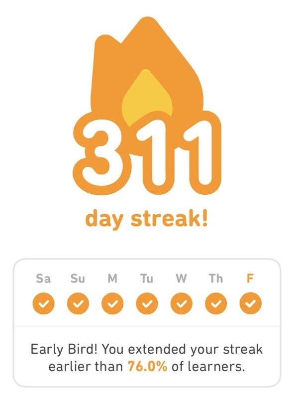
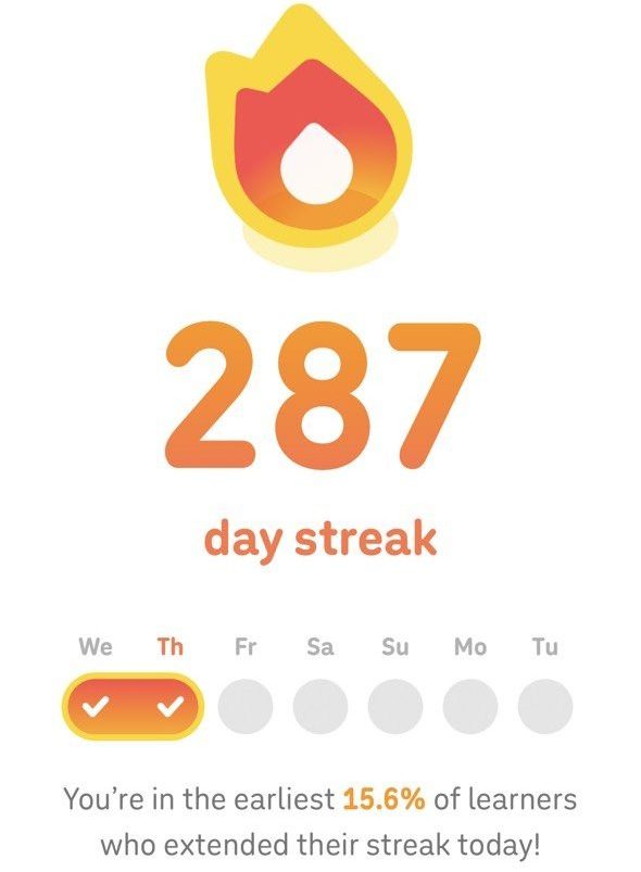
The plot below displays all the data I collected, in new-style percentiles. The colours indicate whether each point was recorded before or after 2025, and the shapes show whether it was recorded in Germany or the UK. I was hoping this plot would relate to the Duolingo finishing time distribution.
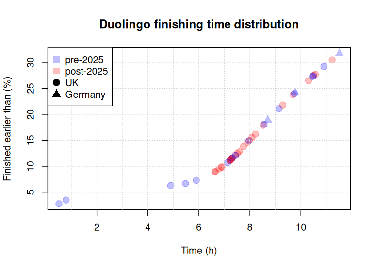
It was quite striking to see that all the data points seemed to sit perfectly on one curve. There was no noise or wiggling around. Remember, these data points had been gathered over several years, on different days and times of the year. But none of this seemed to cause any data points to stray from the overall curve. Also, it did not matter whether I was in Germany (triangles) or the UK (circles). These observations suggest that the percentages shown by Duolingo were not based on real-time data or location. It looks like Duolingo reports these percentiles based on some fixed dataset.
But when do people actually do their Duolingo practice? First of all, percentiles are only shown by the app before noon. So, from the data we have, we can only reason about the morning hours. From the plot above, it is clear that the percentage does not increase much between 2 and 6 am. This makes sense because most people are probably asleep then. The increase then speeds up around 6 am and seems to keep going at a similar rate from 7 am onwards.
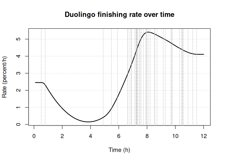
Now, let’s look at this in terms of a rate. That is, how many users finish their first practice per unit of time. This rate changes throughout the morning. An obvious unit for this rate is ‘percent users finished per hour’ (or %/h). So, I filled in the gaps between the data points using a spline, from which I derived hourly finishing rates (shown in the plot below). As expected, this shows a low finishing rate at 4 am, less than 0.5%/h. The rate then picks up and reaches its peak of greater than 5%/h at 8 am. After that, the rate drops slightly, but it remains above 4 %/h. The observation times of my data points are indicated by vertical dashed lines. Note that there are no observations between around 1 am and 5 am. So, there is some uncertainty about the exact rates during this time. But clearly, the overall rate has to be low in the early morning as there is little percentage change then.
Conclusion
It’s quite interesting how Duolingo sometimes shows us where we stand in the daily finishing time distribution. By looking at the data I’ve collected, was able to piece together a bit of that distribution. This lets us create a finishing rate curve, which indicates that most people start their first practice around 8 am. The fact that the finishing time curve is consistent suggests that the numbers Duolingo displays are based on averaged data, possibly from a single, somewhat dated, dataset.
If you have any thoughts or questions, please feel free to reach out.
How was it done?
I took the time and date of creation, along with the percentage shown in each of my Duolingo screenshots, and saved them in CSV format. Then, I used R to analyse the data. The lubridate package is fantastic for working with date and time strings. I used the mgcv package to fit the spline. I also checked if using two different splines—one for data before 2025 and another for data after—would give a better model fit. It didn’t. Data and code are on GitHub, feel free to take a look.


